Monday, 25 July 2011

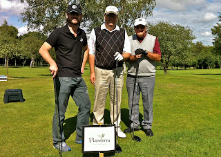
Trident and Planeterra Charity Golf Day 8th July 2011

Sixty golf enthusiasts took to the greens for a charity fund raising event,
to raise money for a charity supporting people with eye disease.

The event at Forest Hill Golf Club in Botcheston included 18 holes of golf and an evening reception attended by 80 guests, which together raised more than £4,500 for the Gap Adventures 20/20 Vision Centre in Cambodia which is essential to treat people with many of the causes of blindness.

The winner of the golf event was Jamie Kendrick (12) who played alongside his dad Mark Kendrick as part of the team from Graypaul of Nottingham who co-sponsored the event. He won with 39 points playing Stapleford and the Graypaul four ball won the team challenge.

With torrential rain 30 minutes before heading out; Trident Managing Director Chris Burrage said: “The weather was kind to us and it was a brilliant day – raising £4,500 which is far more than we had hoped for.

“It was fantastic that such a young golfer won the event and Jamie is obviously a talent to watch out for in the future.

“Having raised money for local charities in the past and, following the success of this event, we plan to do something equally as challenging in future years and make this a fixture in the local business fund raising calendar.”

Chris continued that the event was something very close to his heart: “We do a lot of work in the travel industry, including Gap Adventures who set up the Planeterra charity, and wanted to organise this event to support the work they do in Cambodia which is still recovering from 30 years of civil war and widespread poverty. 

“The Cambodian government can’t address the problem of preventable and treatable blindness without external assistance yet cataracts account for 69% of the preventable blindness and more than 80,000 are waiting for an operation.

“Having undergone two cataract operations over the years, I know just how debilitating poor eyesight can be and the joy and relief of being able to see properly again, so I understand how much a simple operation that will be available in Cambodia can help people.”


We would like to thank all of our sponsors, companies and individuals who donated raffle prizes and all the people that came on the day. Without them, we would not have managed to raise such a great amount of money.


For more information on Planeterra and Gap Adventures 20/20 Vision Centre click here: http://www.planeterra.org


Logo Design Process

Trident have read and researched the logo design process, these facts and opinions are taken from the best websites to give you the most balanced opinions from around the world. We hope you find this as interesting and as insightful as we have.

Want to know the secrets of how top graphic designers create their logos?

This article will reveal exactly how top logo designers of today’s modern age create their logos. It will show the design process that these designers go through to get to their final logo design.

Their Design Process:

   1. The Brief
   2. Research
   3. Visual Research
   4. Sketching & Conceptualising
   5. Reflection
   6. Positioning
   7. Presentations
   8. Celebration


1. The Brief

Nearly all designers agree that the initial accumulation of information from the client is the most important step, either by a face to face interview or a questionnaire. This is where you must establish the design brief. Designer, John Homs says “You really need to understand your client very thoroughly before you get started. Logo Design is never just shooting in the dark. It’s just the opposite.”

2. Research

After moulding the design brief, getting to know your client’s businesses is the next crucial step in making a logo successful. Research includes general reading on the industry itself, sometimes on its history, and on its competitors. If budgets allow, external research can be carried out.

3. Visual Research

This is research not into the clients business, but into the actual logo style. This is where we seek out a look, a style, an approach or attitude, usually to attain a period or style that we are unfamiliar with, or to refresh ourselves with what is new or successful. Eg. Find logos of similar business’ and critique them. This is where you look for inspiration.

Note: Some designers actually refuse the use of visual research, preferring to use their own mental source book, however others say that doing so, is limiting your design solution.

5. Reflection


Taking breaks is as important as the physical research and the design brief. It is so easy to get stuck in a creative cul-de-sac (learn how to be creative) and get tired of a project and this is why logo designers take breaks. By resting, your ideas mature and develop in the back of your head. When you go back to your project, you have renewed enthusiasm, insight and opportunity. This is also a good stage to get feedback from others.

6. Positioning

This is where designers choose how to work… they either position themselves like contractors and take orders according to their clients wishes (ie. Don’t advise their clients of design matters) OR they position themselves like a business and build themselves a long term relationship (ie. Guide clients to a more appropriate solution much alike how a lawyer does). Designers have to choose how they wish to work.

7. Presentation

This is where the designer must present their work to the client. They can choose whether to show the client a huge variety of logo design concepts (if it is hard to gauge a clients taste) OR they could choose to showcase just a few select logo designs. This is another debatable issue. I personally, present only the best 1 or 2 concepts.

So thats all for now folks, if you want to visit our website for information and helpful tips please visit www.tridentdesign.co.uk

Tuesday, 19 July 2011

How to choose colours and fonts that fit your brand

Trident have read and researched how to choose colours and fonts that fit your brand, these facts and opinions are taken from the best websites to give you the most balanced opinions from around the world. We hope you find this as interesting and as insightful as we have.

Corporate branding helps a product get easily recognised by consumers. The association of a company’s name to the brand of a product or service characterizes it. There are several reputable companies such as Coca Cola, Google, and IBM that are successful in using corporate branding to attract more customers.

Small and medium sized businesses can also benefit from branding. The brand of a certain product will tell much about the seller. Once your business has built a reputable brand, your customers will easily develop trust toward your products and services.

One thing to consider in creating your brand is the best set of colours and fonts to represent it. But, branding doesn’t only stop in the conception of a name; you have to make your brand image unique so that it can easily be recognized separately from other brands. The fonts and colors chosen play a huge role in making a brand image distinct. You have to develop a sense of consistency and familiarity by using one font and color palette in all the marketing materials to be used in promoting your brand.

In creating your brand image, make sure that all the elements of your brand reflect your company. If you have a conservative business, you wouldn’t pick loud and complicated colours. Different colors symbolise different ideas.

Below are the most popular colors with their corresponding associations.
• Blue – authority, integrity, intelligence, peace, and loyalty
• Green – growth, optimism, nature, relaxation, and youth
• Yellow – warmth, happiness, warning, and energy
• Orange – force, determination, vitality, success and productivity
• Red – passion, power, action, desire, and love
• Purple – spirituality, mystery, wealth, ambition, and royalty

Your brand image should also match the personality and preferences of your clients. What better way to attract customers than giving in to their wants? Corporate branding is a tested and proven strategy because the companies involved know how to delight their customers.

You should develop your own qualifications in identifying the font and colors that will suit your brand. No one knows your company better than yourself. But to help you in creating a corporate identity and choosing the most effective fonts and colors to use in your brand, you can contact us anytime. So thats all for now folks, if you want to visit our website for information and helpful tips please visit www.tridentdesign.co.uk

Wednesday, 13 July 2011

Trident goes to visit the land of Paper...

When the opportunity to travel to Germany to visit a paper mill and see how paper is made arose, I was more than happy to – the chance to learn more about how the material we use every day for our clients’ work was something I wasn’t about to miss out on.

For many, paper is just something that brochures and magazines are printed onto, but there is so much more it, and it can often give a massive indication as to the quality of the item that it is selling, just from the look and feel of the surface of the paper.


 So, after a 4am start, and the early morning flight from London into Munich we were picked up by Tony and the driver. We were then driven across Bavaria at break-neck speed down the autobahn to the Myllykoski paper mill in Plattling, on the edge of the mountains and forest.


On arrival to the mill, the scale of the site was the first thing that struck me – there aren’t many places I have been with 2 train tracks coming into their business premises!

After seeing some of the 2000m3 of logs used each day being precisely trimmed into 0.5m pieces and then stripped of bark, then promptly ground under extreme pressure to produce the pulp, we went to see the largest machine I have ever seen – these paper machines make web-offset presses seem small (in fact it is the second biggest paper machine in Europe)!


After the pulp is added to the wire it is then pressed under 800 tonnes of pressure and heated under steam to dry the paper out and then rolled to smooth it out. The pictures can explain this in more detail, rather than me trying to simplify the process to get it into words.

The sheer scale of the factory and the amount of power, pressure, steam, wood, water is used to produce something that we all take for granted in our every day life, allowed me to see why paper was so expensive to buy. European forests are very well managed, and almost all the wood used is from forests that are farmed and replaced when tress are felled. The most interesting thing that I found was that despite all the water used, the mill actually feeds back the same amount of water into the river that it takes out – so none is wasted!

After 4 hours of being shown the interesting method of producing paper, and learning the difference between how gloss, silk and matt paper are produced we left the factory, and headed out into Munich for some fantastic Bavarian food, and of course, plenty of beer and schnapps!

Is it time to redesign your logo?

Trident have read and researched the key elements for reasons to redesign a logo, these questions and facts are taken from the best websites to give you the most balanced opinions from around the world. We hope you find this as interesting and as insightful as we have.

You should ask yourself few questions to find out whether your logo needs a redesign. If your answer is no to all or most of the questions below, then an effective logo redesign is the solution.

1. See your logo closely not being as a business owner rather being as a customer. What do you feel? Does the design appeal to you?

2. Are the colours, font, style and other elements recognised easily?

3. Does it look fresh and modern?

4. Is it successful in portraying the business image to your target audience?

5. Is it compatible with all the advertising and marketing mediums?

6. Is it unique and doesn’t match with any other logo?

Reasons for face lift

Improving small bits of elements in your logo sometimes become crucial. There are several reasons that can justify the above mentioned comments:

1. Giving a new look to your logo can be eye-catching to viewers. The graphics, images, colours, fonts used in the logo must all reveal the aesthetic element of the design. If the logo you have does not meet the above standards, a logo redesign is highly recommended to earn benefits from it.

2. Fonts, colours, and all other elements in your logo should be located in such a way that they are easily visible to the viewers. If the fonts are hard to read, or the logo is over-crowded with too many colours, it tends to irritate the viewer, who is more likely not to recognise your logo next time he sees it. Whereas, simple and easy to recognise logo will allow the viewer to memorise it at a glance. If your current logo has necessary message buried that irritates the viewer in finding the purpose of your business, then a logo redesign is a turnkey solution to draw attention of the viewers.

3. The style of your logo is another very important factor. There may be several things that you look for and want to put in your logo. But at the same time you should keep in mind that the style should be similar to the aspects like the type of your business or the kind of your target audience. If the logo you own does not suitably portray your business purpose to the old customers, logo redesign is necessary in order to carry targeted message accurately and efficiently.

4. Logo design trends have been constantly changing. In addition, contemporary logos reflect the company’s image as an innovative and modern. Thus, if your logo is not according to contemporary logo design trends, you will be seen as old world compared to competition. Would you want that to happen or would you prefer redesigning your logo...

5. Take into account, how you are going to use your logo on different marketing and advertising mediums like billboards, brochures, letterheads, pens, buttons etc., your logo is meant to be versatile, and its design should bestowed to any use imaginable. But, if your logo is not compatible with all the available mediums, it’s better to consider a redesign.