So, if you are in the design trade you will no doubt come across those day-to-day pet hates, which mainly come in the form of supplied artwork and images!! Working as a Graphic Designer I have come across alot of these, below are a few examples. Do you agree? Are there any you would add to the list!??
• Using Comic Sans font
• Force justifying paragraphs
• Supplying web image for printing
• Supplying what you think is 'suitable artwork' in Powerpoint or Word
Interestingly, if you search on the net for 'You know your a Graphic Designer when...' you get some funny results:
You know you're a Graphic Designer when:
- Seeing someone use Lens Flare or Comic Sans affects your blood-pressure
- Looking at a menu make you go “hmmm, ITC Baskerville italic” rather than “mmmm, lunch!”
- Apple+Z is the first thing that goes through your mind if you drop and break something.
- Your significant other/ friends have threatened to never speak to you again if you point out one more font to them.
- Your hand is permanently stuck in the shape of a mouse
- You organize your CD collection according to the Pantone chart.
Ok, so slightly mocking the graphic designers of this world but im sure you will find them just as amusing as me and if you have any to add please feel free....
To find out more about Graphic Design visit www.tridentdesign.co.uk
Wednesday, 20 April 2011
Friday, 15 April 2011
Creative Inspiration
Creative Inspiration
When graphic designers need creative inspiration for there work, where do they go to?
Books from Amazon.co.uk or ask a friend for a recommendation.
The trouble is they've been done before there old ideas!
Thankfully, designers can now seek, search, or come across the most creative solutions by one click of the mouse. With millions and millions of images with the most up to date trends in layout, colour use, fonts and use of imaginary with in the material
Secondly is monthly magazine’s not only do they cover whats creative, they keep you up to date with the latest design tips for such programmes as Photoshop and Illustractor
Below is a short list of the top 5 graphic designers magazines
1. CREATIVE REVIEW
Creative Review is a monthly magazine targeted on the commercial arts and design scene.
2. PRINT Magazine
PRINT is an extremely popular bimonthly graphic design magazine about visual culture and design.
3. I.D. Magazine
I.D Magazine is a leading critical magazine covering the art, business, and culture of design.
4. HOW Design
HOW magazines goal is to help designers run successful, creative, profitable studios and much more.
5. Communication Arts
Communication Arts is an amazing art and design magazine that consists of eight issues and includes the Design, Advertising, Illustration, Photography and Interactive annuals.
Also If you want to discover new ideas, you should try looking in all of the places you’ve been, but not looked in detail ie looking a posters and signs when traveling to work!!
Please visit our website for more up to date Blogs on www.tridentdesign.co.uk
Inspirational artists - What makes me tick!!
My Inspirational Artists
The 'design world' is full of inspiration and visual treats! From typographers, photographers, artists and designers here are a selection of my favourite artists, these incredibly talented and creative people have inspired and pulled at my creative heart strings since i first realised my passion for design. Let us know what you think and who your favourite artists are...
 Wassily Kandinsky (16 December 1866 – 13 December 1944), was a Russian painter, and art theorist. He is credited with painting of the first purely abstract works.
"Colour is the keyboard, the eyes are the harmonies, the soul is the piano with many strings. The artist is the hand that plays, touching one key or another, to cause vibrations in the soul."
 Banksy is an anonymous English graffiti artist, political activist, film director and painter. He began as a freehand graffiti artist 1992–1994. He was inspired by local artists and his work was part of the larger Bristol underground scene.
Banksy's stencils feature striking and humorous images occasionally combined with slogans. The message is usually anti-war, anti-capitalist or anti-establishment. Subjects often include rats, apes, policemen, soldiers, children, and the elderly.
Georgia O'keeffe (Nov 15 1887 – March 6 1986), was an American artist.
She was mainly recognised for paintings of flowers, rocks, shells, animal bones, and landscapes in which she synthesized abstraction and representation.
Her paintings present crisply contoured forms that are replete with subtle tonal transitions of varying colors.
 Warhol (August 6 1928 – February 22 1987), was an American painter, printmaker, and filmmaker who was a leading figure in the visual art movement known as pop art. The highest price ever paid for a Warhol painting is $100 million for a 1963 canvas titled Eight Elvises.

Mark Rothko (Sept 25, 1903 – Feb 25 1970), was a Latvian-born American painter. He is classified as an abstract expressionist, although he himself rejected this label, and even resisted classification as an "abstract painter".
"We favor the simple expression of the complex thought. We are for the large shape because it has the impact of the unequivocal. We wish to reassert the picture plane. We are for flat forms because they destroy illusion and reveal truth."
For more information about Graphic Design and Print, please visit our website: www.tridentdesign.co.uk
Thanks for viewing my blog
The 'design world' is full of inspiration and visual treats! From typographers, photographers, artists and designers here are a selection of my favourite artists, these incredibly talented and creative people have inspired and pulled at my creative heart strings since i first realised my passion for design. Let us know what you think and who your favourite artists are...
 Wassily Kandinsky (16 December 1866 – 13 December 1944), was a Russian painter, and art theorist. He is credited with painting of the first purely abstract works.
"Colour is the keyboard, the eyes are the harmonies, the soul is the piano with many strings. The artist is the hand that plays, touching one key or another, to cause vibrations in the soul."
 Banksy is an anonymous English graffiti artist, political activist, film director and painter. He began as a freehand graffiti artist 1992–1994. He was inspired by local artists and his work was part of the larger Bristol underground scene.
Banksy's stencils feature striking and humorous images occasionally combined with slogans. The message is usually anti-war, anti-capitalist or anti-establishment. Subjects often include rats, apes, policemen, soldiers, children, and the elderly.
Georgia O'keeffe (Nov 15 1887 – March 6 1986), was an American artist.
She was mainly recognised for paintings of flowers, rocks, shells, animal bones, and landscapes in which she synthesized abstraction and representation.
Her paintings present crisply contoured forms that are replete with subtle tonal transitions of varying colors.
 Warhol (August 6 1928 – February 22 1987), was an American painter, printmaker, and filmmaker who was a leading figure in the visual art movement known as pop art. The highest price ever paid for a Warhol painting is $100 million for a 1963 canvas titled Eight Elvises.
Mark Rothko (Sept 25, 1903 – Feb 25 1970), was a Latvian-born American painter. He is classified as an abstract expressionist, although he himself rejected this label, and even resisted classification as an "abstract painter".
"We favor the simple expression of the complex thought. We are for the large shape because it has the impact of the unequivocal. We wish to reassert the picture plane. We are for flat forms because they destroy illusion and reveal truth."
For more information about Graphic Design and Print, please visit our website: www.tridentdesign.co.uk
Thanks for viewing my blog
Wednesday, 13 April 2011
5 easy steps to improve website Search Engine Optimisation (SEO)
Finding the keys to search engine optimisation (SEO) can seem daunting but with this element on your side you could unlock a money making enterprise. You need to think of your website as a property and the possibilities from this as investments. To market any property, in our case a website, generate revenue you need a good estate agent to market your interests, this is what we call SEO. Many consumers and businesses use search engines as the first step in a purchasing decision so it is important to make SEO work hard for you!
On the journey to a high ranking website SEO is a great first step to increasing sales. To excel in this area involves a lot of time and expertise, but in this blog we have included some easy ways to begin to improve your results.
Below are some initial ways to get better SEO results:
1. A little keyword research makes a big difference. Keyword research can be as simple as a team brainstorm. When you think about keywords, don’t just think about your company name—think about your products, and how people would try to find them. For example, if you sell large format printing, think about keywords like “buying large printing” or “printing larger format [insert your geographic region].”
Once you’ve identified the keywords you want to target, you should use them throughout your SEO efforts. Optimising your site with the right keywords will drive more qualified traffic, and get your business more leads.
2. Change up your titles. Make sure that every page on your site has a different title that showcases the relevant keywords for that page. This sounds simple, but it’s often forgotten. Not only are titles highly important they are the first thing that people see when they look at a page of search results. Changing the title of each page can give a website a huge boost in search engine rankings.
3. Make sure you have the right metadata. Meta-descriptions and keywords are also important. Many web designers will not include meta-descriptions and keywords in their code. These descriptions and keywords aren’t visible to your visitors, but provide important clues for search engines as to what information is contained on the page. "Meta descriptions are especially important, because they usually appear on search engines, right below the title. Those descriptions are your first chance to grab the attention of a potential client or customer”
4. Link building. Search engines determine their rankings partly by relevance of content, and partly by how many other sites link to your site. Whether links are on a site like Facebook or some other social media properties, or in a comment on a blog, links back to your website will help your search engine rankings. Also make sure that your website is linking to itself. Wikipedia does so well in search rankings party because it is chock full of internal links.
5. Grade your website. Use the fantastic free tools available to help you analyze your website.Woorank.com gives some great SEO advice, as does HubSpot’s Website Grader. These tools analyze almost every aspect of SEO on your website.
Bonus tip: don’t cheat the system
Search engines aren’t stupid. Or particularly forgiving.
We understand that the world of SEO is a fast paced and in a state of constant change but with this environment said its important to keep to a strategy just to get your foot on the ladder.
For more information about graphic design and print please visit our website www.tridentdesign.co.uk
Friday, 8 April 2011
What makes a good or bad logo
Logo design in today’s world can make or break a product...
Two example of a really good logo design are Apple Computer, Inc. (Apple Icon) and Nike, Inc. sportswear (Swoosh Icon).
Apple's first logo depicts Sir Isaac Newton sitting under an apple tree. This was replaced by the rainbow Apple", the now so familiar silhouette of an apple with a bite taken out of it. The coloured stripes were to represent the relise of the colour monitor.
In 1998, Apple discontinued the rainbow theme and began to use a plain silhouette to be more clear on all coloured backgrounds, products, packaging and advertising.

Nike (mythology), Greek goddess who personifies victory.
1971 the mark now known globally as the Swoosh was designed. The Top people at Nike told the designer. "I don't love it," they told her, "but I think it will grow on us”. The swoosh is most recognisable logo to date.

A logo needs to describable, memorable, effective without colour, scalable i.e. work when just an mm’s in size.. Both Apple & Nike use these methods to the best.
The importance of logo design for business is one of the most imports things.. so a badly designed logo cannot help even a successful product. A badly designed logo generally uses a Rainbow Gradients, Comic Sans, Bevel Emboss, Bad Grammar, Off Centered Type, an image used which is not relevant to the product and also an offensive portrait of imagery or type used.
One example of mixed opinions is the London 2012 Olympic Games logo. When this was first revealed people thought that the logo resembled an offensive image... plus the TV ad campaign caused some people to have epileptic fits. Has the bad publicity lead to greater publicity?

For more information visit www.tridentdesign.co.uk
Two example of a really good logo design are Apple Computer, Inc. (Apple Icon) and Nike, Inc. sportswear (Swoosh Icon).
Apple's first logo depicts Sir Isaac Newton sitting under an apple tree. This was replaced by the rainbow Apple", the now so familiar silhouette of an apple with a bite taken out of it. The coloured stripes were to represent the relise of the colour monitor.

Nike (mythology), Greek goddess who personifies victory.
1971 the mark now known globally as the Swoosh was designed. The Top people at Nike told the designer. "I don't love it," they told her, "but I think it will grow on us”. The swoosh is most recognisable logo to date.

A logo needs to describable, memorable, effective without colour, scalable i.e. work when just an mm’s in size.. Both Apple & Nike use these methods to the best.
The importance of logo design for business is one of the most imports things.. so a badly designed logo cannot help even a successful product. A badly designed logo generally uses a Rainbow Gradients, Comic Sans, Bevel Emboss, Bad Grammar, Off Centered Type, an image used which is not relevant to the product and also an offensive portrait of imagery or type used.

For more information visit www.tridentdesign.co.uk
Thursday, 7 April 2011
Best and useful Apps for Graphic Designers....
Whether at a meeting, or at lunch your iPhone goes everywhere with you, so whilst on the move its important to have apps that will help your work flow or visualisation whilst your away from your desk. Whilst there are hundreds of apps out their for the Graphic Designers and the design interested not all of them are helpful, well designed or easy to use and dare we mention FREE! Through having the 1st iPhone to the iPhone 4 and iPad we have an acute sense of what is really helpful and will give you the results you need whilst on the go. Not all of these apps have a serious work related need, but all are design related and whilst reading this blog we hope to give you something you can take and use so get to the App store and get downloading because all these Apps are FREE and AMAZING!
myPANTONE
http://itunes.apple.com/us/app/mypantone/id329515634?mt=8
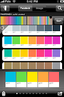
A very interesting App which allows the user to have a Pantone Book at the touch of a button for the cracking price of £5.99. A set of 6 pantone books are worth £200-300, so if you think
you gain “the ability to build color palettes and share them with colleagues and clients. myPANTONE offers graphic, Web, fashion and apparel designers a way to take PANTONE Colors with you wherever you go.” The only negative of this App is there is no Pantone to process section (CMYK). This has to be its only down fall but its definitely worth the money!
Top features:
• Get color inspiration and create color schemes from these PANTONE Color System Libraries:
• New PANTONE PLUS Formula Guides coated and uncoated with 224 new colors
• New PANTONE PLUS Premium Metallics coated
• New PANTONE PLUS Pastels & Neons coated and uncoated
• Includes sRGB, HTML and L*a*b* data
• Capture and extract colors from photos and snap to the closest PANTONE Color
• From images loaded on your iPhone
• Directly from images taken with your iPhone camera
• Once created, share color palettes in a variety of ways:
• E-mail an HTML image of your palette
• E-mail color palettes for use in Adobe® Creative Suite® (.ase files), QuarkXPress® and CorelDraw®
PS Express
http://itunes.apple.com/us/app/adobe-photoshop-express/id331975235?mt=8
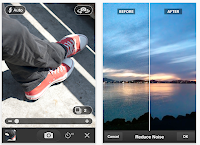
If you use photoshop on a regular basis you’ll understand its significance in the industry, but for the designer on the go, where is Photoshop when you need to re touch a image for a client or for yourself and email it whilst on the go? Look no further than PS Express, for a completely FREE app you can do a lot with it. “With Photoshop Express, it’s easy to improve your photos. Choose from a variety of one-touch effects, or simply drag your finger across the screen to crop, rotate, or adjust color. Add artistic filters like Soft Focus or Sketch. And never fear: You can undo and redo changes until you get just the look you want—a copy of your original file is always saved.”
Top features:
• Basics: Crop, Straighten, Rotate, and Flip
• Color: Exposure, Saturation, Tint, Black and White, and Contrast
• Filters: Sketch, Soft Focus, and Sharpen
• Effects: Vibrant, Pop, Border, Vignette Blur, Warm Vintage, Rainbow, White Glow, and Soft Black and White
• Borders: Rectangle, Rounded, Oval, Soft Edge, Vignette, Rough Edge, Halftone, and Film Emulsion

Adobe Ideas
http://itunes.apple.com/us/app/adobe-ideas/id364617858?mt=8#
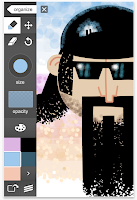
Some times its so much easier to sketch your ideas than verbally explain them, this app has professional capabilities, without a doubt this app is extremely useful for on the go idea making and client meetings. Imagine sitting at a cafe and seeing visual inspiration, with this app you can take a picture and write your notes all over it and then send it anywhere you wish. Any time you need to explore creative ideas, Adobe Ideas is there with you.
Top features:
• Simple vector-based drawing tools
• Zoom without jaggies or big pixels
• Variable-size brushes using multi-touch control
• Vector eraser
• Gallery-style organizer to quickly scroll through your ideas and color themes
• Huge virtual canvas

What the font
http://itunes.apple.com/us/app/whatthefont/id304304134?mt=8#
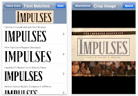
Ever seen a great font in a magazine ad, poster, or on the web and wondered what font it is? Whip out your iPhone and snap a photo, and WhatTheFont will identify that font in seconds! Its great when you need to identify a clients font used in their logo or website, this cuts the time you spend searching through font libraries from hours to seconds. From our experience What the font isn’t always correct but it gets the font close to the font you need.
In our opinion its are favorite and most useful app, we could not work without it.
WhatTheFont for iPhone connects directly to a font identification service, which has been helping customers pinpoint mystery fonts at the MyFonts.com web site for 10 years. It works via Wi-Fi or the mobile phone network, so you can get your font fix right there on the spot.
Top features:
• Snap a photo right within the app
• Choose saved photos from the Photo Library
• In-phone image processing optimizes upload for speed and accuracy
• View font details within the app
• Send e-mail summaries of search results, complete with font previews
So thats all for now folks, if you want to visit our website for information and helpful tips please visit www.tridentdesign.co.uk


myPANTONE
http://itunes.apple.com/us/app/mypantone/id329515634?mt=8
A very interesting App which allows the user to have a Pantone Book at the touch of a button for the cracking price of £5.99. A set of 6 pantone books are worth £200-300, so if you think
you gain “the ability to build color palettes and share them with colleagues and clients. myPANTONE offers graphic, Web, fashion and apparel designers a way to take PANTONE Colors with you wherever you go.” The only negative of this App is there is no Pantone to process section (CMYK). This has to be its only down fall but its definitely worth the money!
Top features:
• Get color inspiration and create color schemes from these PANTONE Color System Libraries:
• New PANTONE PLUS Formula Guides coated and uncoated with 224 new colors
• New PANTONE PLUS Premium Metallics coated
• New PANTONE PLUS Pastels & Neons coated and uncoated
• Includes sRGB, HTML and L*a*b* data
• Capture and extract colors from photos and snap to the closest PANTONE Color
• From images loaded on your iPhone
• Directly from images taken with your iPhone camera
• Once created, share color palettes in a variety of ways:
• E-mail an HTML image of your palette
• E-mail color palettes for use in Adobe® Creative Suite® (.ase files), QuarkXPress® and CorelDraw®


PS Express
http://itunes.apple.com/us/app/adobe-photoshop-express/id331975235?mt=8
If you use photoshop on a regular basis you’ll understand its significance in the industry, but for the designer on the go, where is Photoshop when you need to re touch a image for a client or for yourself and email it whilst on the go? Look no further than PS Express, for a completely FREE app you can do a lot with it. “With Photoshop Express, it’s easy to improve your photos. Choose from a variety of one-touch effects, or simply drag your finger across the screen to crop, rotate, or adjust color. Add artistic filters like Soft Focus or Sketch. And never fear: You can undo and redo changes until you get just the look you want—a copy of your original file is always saved.”
Top features:
• Basics: Crop, Straighten, Rotate, and Flip
• Color: Exposure, Saturation, Tint, Black and White, and Contrast
• Filters: Sketch, Soft Focus, and Sharpen
• Effects: Vibrant, Pop, Border, Vignette Blur, Warm Vintage, Rainbow, White Glow, and Soft Black and White
• Borders: Rectangle, Rounded, Oval, Soft Edge, Vignette, Rough Edge, Halftone, and Film Emulsion


Adobe Ideas
http://itunes.apple.com/us/app/adobe-ideas/id364617858?mt=8#
Some times its so much easier to sketch your ideas than verbally explain them, this app has professional capabilities, without a doubt this app is extremely useful for on the go idea making and client meetings. Imagine sitting at a cafe and seeing visual inspiration, with this app you can take a picture and write your notes all over it and then send it anywhere you wish. Any time you need to explore creative ideas, Adobe Ideas is there with you.
Top features:
• Simple vector-based drawing tools
• Zoom without jaggies or big pixels
• Variable-size brushes using multi-touch control
• Vector eraser
• Gallery-style organizer to quickly scroll through your ideas and color themes
• Huge virtual canvas


What the font
http://itunes.apple.com/us/app/whatthefont/id304304134?mt=8#
Ever seen a great font in a magazine ad, poster, or on the web and wondered what font it is? Whip out your iPhone and snap a photo, and WhatTheFont will identify that font in seconds! Its great when you need to identify a clients font used in their logo or website, this cuts the time you spend searching through font libraries from hours to seconds. From our experience What the font isn’t always correct but it gets the font close to the font you need.
In our opinion its are favorite and most useful app, we could not work without it.
WhatTheFont for iPhone connects directly to a font identification service, which has been helping customers pinpoint mystery fonts at the MyFonts.com web site for 10 years. It works via Wi-Fi or the mobile phone network, so you can get your font fix right there on the spot.
Top features:
• Snap a photo right within the app
• Choose saved photos from the Photo Library
• In-phone image processing optimizes upload for speed and accuracy
• View font details within the app
• Send e-mail summaries of search results, complete with font previews
So thats all for now folks, if you want to visit our website for information and helpful tips please visit www.tridentdesign.co.uk
Tuesday, 5 April 2011
CMYK & RGB Explained
 What is CMYK and RGB i hear you say, how do these 2 colour models work and when do we use them?
CMYK stands for cyan, magenta, yellow & black. These are the four colors of ink used in the four colour printing. CMYK is a color mixing system that depends on chemical pigments to achieve the desired hues.
Each image/print is made into a plate, each plate then has the desired amount of ink applied to it - when the four plates print onto a page, the colors recombine and forms the original image.
Now that we live in a digital age, much is made of the conversions between CMYK color and RGB.
RGB color varies light, instead of pigment, we see RGB color on monitors that actually emit light rather than reflect existing light. Therefore, the screen image of a picture in RGB will never match the printed image in CMYK.
The RGB color model is an additive color model where red, green, and blue light are added together in various ways to reproduce a broad array of colors. The name of the model comes from the initials of the three additive primary colors, red, green, and blue.
CMYK is used for printed items. i.e. your company brochure, stationery and leaflets
RGB is used for screen viewing items. i.e. your website and eshots
For more important information on topics of design and print, please visit our website www.tridentdesign.co.uk
For more important information on topics of design and print, please visit our website www.tridentdesign.co.uk
Subscribe to:
Comments (Atom)

