Friday, 30 September 2011
Graduate to Design Studio, the differences they don’t teach at University…
Heres abit of background into my experiences
So I attempted to enter the industry straight after college thinking I knew A-Z about everything, evidently not, being in the industry and being taught Graphic Design at college I have found are two completely different things. Yes you get taught the basic knowledge of how a Graphic Designer will work and produce things, but, what they don't let you in on is that your kept in a bubble whilst your there nothing is as it seems when you get into industry. Those entire creative brief's you get, all those fancy ideas you can come up with all those different materials and processes you can use, well unless you can get into a big fancy studio that has the time and money to let you be, then think again.
I was one of those students that used every different process and material that I could get my hands on, but I dismissed the idea of using the computers and adobe suits most of the time. I used them for the very basics to produce the end products and then I didn't use them to there full potential and because I wasn't told at college that this would be an issue later on in my career I carried on and as I was getting good grades. I thought I was going down the right route, to me there was no issue and I’d jump straight into the industry and someone would see my potential. How wrong was I, and if I'm completely honest, how mad I was that my tutor I trusted didn't tell me my faults. Looking for a job as a Junior Graphic Designer was a nightmare, everyone wanted:
- Perfect computer skills in adobe
- 2 years experience within the industry
- Website design skills
These of which because of the way I'd worked for the past four years were a major set back,
- I could use the Adobe suits but didn't have huge amounts of experience on them,
- Experience within the industry, well that was zero (panic started to set in)
Then just to top things off
- Some of the job titles stated that they wanted a "Junior Graphic Designer / Web designer"
I hadn't even touched on websites. What was I going to do now, I hadn't had a reply back from any graphics places in months and my confidence was taking a battering, so time to sort this.
Light at the end of the tunnel
I began to write letters addressed to studios I'd found on the net, in the yellow pages explaining my dilemma and asking for there help, and to my Joy I have now been to two different studios and I'm working my way up, learning what I need to know and hopefully fingers crossed I'll become that designer I still dream of.
Take a look on this link its got some good points and its something I'd wished that I had read whilst at college-
http://www.jamiewieck.com/visual-essays/the-50-things-every-graphic-design-student-should-know/
For more information on how we can help you visit: www.tridentdesign.co.uk
Tuesday, 20 September 2011
Local Businesses Work Together to Market Out of Recession
A Hinckley company’s investment in a new marketing campaign has significantly boosted its order book and secured its future.
Strata Designs in New Street, Hinckley, has worked with nearby Trident Design and Print to develop a marketing brochure for its Cyber Glow range of high visibility reflective safety products and promotional items.
Strata Designs, a family-owned business established for 25 years and now employing 15 people, recognised that they needed to step up their marketing strategy to secure orders in a challenging market and appointed Trident to handle the design and print of its first brochure.
 |
| Chris Burrage and David Beer - Trident and Strata Design MD's |
Managing Director David Beer explained: “The Cyber Glow side of the business specialises in high visibility reflective products aimed at local authorities, Government departments, road safety programmes and promotional companies.
“We have a website and had produced a series of flyers with different products but orders have been increasingly difficult to secure. Our target market is largely public sector who are obviously under budget constraints so we knew we needed to work harder and smarter to ensure the limited spend on items such as these come to us.
“The feedback from existing and potential customers was that they wanted something that made it easy to buy and quick to refer to. We have therefore invested in our first full colour brochure which has brought together all of our stock range.
“We were looking for a local company who we could work closely with particularly as this was our first venture of this kind and wanted face to face contact with the design company.
“We found Trident who were, by chance, just around the corner and have effectively become our in-house design department.
“Using Trident’s expertise and experience, we have been able to produce a high quality brochure which has resulted in several thousands of pounds worth of new orders and ongoing repeat orders from established customers.
“This first project has been a huge success with a high quality product delivered on time and on budget and now reaping positive results for our business and we are already planning to expand the brochure and double the print run for distribution in the UK.
“We are also looking at doing more exhibitions and will be taking the product out throughout Europe – particularly in countries such as Germany and Italy where the road safety legislation is even more stringent than in the UK and may even result in the brochure being translated into different languages.”
Trident Design and Print Managing Director, Chris Burrage explained: “Despite the tough economic climate, we are finding that more and more businesses are recognising that, rather than cutting marketing budgets, they actually need to invest more to ensure they maintain and grow their market share.
“Although online marketing is crucial, Strata are proof that customers still value printed materials and want easy to use and visually appealing brochures which they can keep close at hand to make purchasing decisions.
“Our key message to all our clients is to think carefully about how their customers buy and apply the wide range of marketing communications available to them in the most appropriate and applicable way to their customer base.
“Using our many years of experience in design and print management, we were able to advise Strata on the best eye catching design to maximise the impact of the product range, the most appropriate materials and incorporated subtle but highly effective finishes such as spot varnish to give the brochure a high quality feel.
“The benefit to businesses of using agencies such as ours is that we have the contacts, buying power and product knowledge to ensure that print prices are highly competitive and represent true value for money.
“We are obviously delighted that the production of this brochure has resulted in such tangible results and look forward to working with Strata on an ongoing basis.”
David Beer continued that the re-focused marketing strategy has also encouraged the company to improve its overall production planning.
“It has also helped us to focus on the areas of the business that are the most popular and to develop new products – effectively taking us out of our comfort zone and developing us into a marketing focused business rather than a product focused business.
“It is tempting for any business to keep down costs and go for lower marketing budgets in these difficult times but we have discovered that this was a false economy as it did not reflect the professionalism of the company and the quality of the product.
“Without this new business, we would undoubtedly have been in a difficult trading position and the results we have had in a short space of time have proven to us that we need to market ourselves out of the recession rather than cut costs.”
Tuesday, 9 August 2011
10 Things to expect from your designer
Trident have read and researched the logo design process, these facts and opinions are taken from the best websites to give you the most balanced opinions from around the world. We hope you find this as interesting and as insightful as we have.
Choosing a designer can be a daunting decision for a client. After all, the visual identity of his/her business depends on the choice. Here are a few important attributes to expect from a graphic designer.
1. An informative website
A client should expect to learn something from the designer before paying a penny, and the designer’s online presence should do the job.
Informative websites help on a number of counts.
* Trust is built through communication in blog comments
* Attention to detail can be seen through design project case studies
* Positive references will accompany portfolio entries
* Communication skills are evident through proper grammar
2. Excellent communication skills
3. Attention to detail
Changing smallest detail can greatly alter the impact of a brand identity.
4. Great customer service
How fast can clients expect a response to their questions? Unless prior notice has been given, email replies should be received within 24 hours during a project’s standard working week. Telephone communication should be available throughout normal working hours.
What about after the design handover? A designer should remain on hand to help with any printing questions or file-type issues.
5. Trustworthiness
6. Good time management
Deadlines are a vital part of the design process. A client could be waiting on the designer to finalise the identity before an ad campaign is rolled-out, or before office signage is installed, so the last thing needed is to have the agreed time frame pushed back.
7. Positive references
References — or client testimonials — offer a great insight into previous customer satisfaction.
8. Flexibility
No matter how detailed the initial design brief, there must always be room for flexibility. Things can change during each stage of the process, requiring a different outlook from that first anticipated. Both the client and the graphic designer should accommodate some movement.
9. A strong portfolio
Previous projects speak volumes about what to expect. Rather than focus on my own graphic design portfolio, here are some others containing nice identity design work.When browsing portfolios, it’s good to see design diversity, both in client industry and project outcome.
10. Common courtesy
Nice shouldn’t cost extra.
To reiterate, 10 things to expect from a designer:
1. An informative website
2. Excellent communication skills
3. Attention to detail
4. Great customer service
5. Trustworthiness
6. Good time management
7. Positive references
8. Flexibility
9. A strong portfolio
10. Common courtesy
Wednesday, 3 August 2011
Tips for Working with Clients: Approaching the Relationship
Trident have been through the client process, these facts and opinions are opinions and others opinions to give you the most balanced opinions from around the world. We hope you find this as interesting and as insightful as we have.
Gain clients carefully. Selecting your clients carefully is the first step in a responsible client/designer relationship. You should have a clear idea of who the client is and what needs exist, and the client should have a clear idea of your expertise or that of your firm.
Collaborate and negotiate. Be able to explain your vision to the client and why it’s the best possible solution to their design problem. While you should defend your ideas, when possible it’s a good idea to give in to the client.
Maintain contact. If you are proactive about contacting the client and providing updates, the client will feel important and have more confidence in your work.
Stick to deadlines. It doesn’t matter if you have to give up an occasional weekend or work thirteen-hour days for a week. Part of being a professional designer is getting your work done on time.
For more ideas on handling your relationships with client, visit our website www.tridentdesign.co.uk
Monday, 25 July 2011
Trident and Planeterra Charity Golf Day 8th July 2011
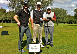 Sixty golf enthusiasts took to the greens for a charity fund raising event,
to raise money for a charity supporting people with eye disease.
The event at Forest Hill Golf Club in Botcheston included 18 holes of golf and an evening reception attended by 80 guests, which together raised more than £4,500 for the Gap Adventures 20/20 Vision Centre in Cambodia which is essential to treat people with many of the causes of blindness.
The winner of the golf event was Jamie Kendrick (12) who played alongside his dad Mark Kendrick as part of the team from Graypaul of Nottingham who co-sponsored the event. He won with 39 points playing Stapleford and the Graypaul four ball won the team challenge.
With torrential rain 30 minutes before heading out; Trident Managing Director Chris Burrage said: “The weather was kind to us and it was a brilliant day – raising £4,500 which is far more than we had hoped for.
“It was fantastic that such a young golfer won the event and Jamie is obviously a talent to watch out for in the future.
“Having raised money for local charities in the past and, following the success of this event, we plan to do something equally as challenging in future years and make this a fixture in the local business fund raising calendar.”
Chris continued that the event was something very close to his heart: “We do a lot of work in the travel industry, including Gap Adventures who set up the Planeterra charity, and wanted to organise this event to support the work they do in Cambodia which is still recovering from 30 years of civil war and widespread poverty.
“The Cambodian government can’t address the problem of preventable and treatable blindness without external assistance yet cataracts account for 69% of the preventable blindness and more than 80,000 are waiting for an operation.
“Having undergone two cataract operations over the years, I know just how debilitating poor eyesight can be and the joy and relief of being able to see properly again, so I understand how much a simple operation that will be available in Cambodia can help people.”
We would like to thank all of our sponsors, companies and individuals who donated raffle prizes and all the people that came on the day. Without them, we would not have managed to raise such a great amount of money.
We would like to thank all of our sponsors, companies and individuals who donated raffle prizes and all the people that came on the day. Without them, we would not have managed to raise such a great amount of money.
For more information on Planeterra and Gap Adventures 20/20 Vision Centre click here: http://www.planeterra.org
Logo Design Process
Trident have read and researched the logo design process, these facts and opinions are taken from the best websites to give you the most balanced opinions from around the world. We hope you find this as interesting and as insightful as we have.
Want to know the secrets of how top graphic designers create their logos?
This article will reveal exactly how top logo designers of today’s modern age create their logos. It will show the design process that these designers go through to get to their final logo design.
Their Design Process:
1. The Brief
2. Research
3. Visual Research
4. Sketching & Conceptualising
5. Reflection
6. Positioning
7. Presentations
8. Celebration
1. The Brief
Nearly all designers agree that the initial accumulation of information from the client is the most important step, either by a face to face interview or a questionnaire. This is where you must establish the design brief. Designer, John Homs says “You really need to understand your client very thoroughly before you get started. Logo Design is never just shooting in the dark. It’s just the opposite.”
2. Research
After moulding the design brief, getting to know your client’s businesses is the next crucial step in making a logo successful. Research includes general reading on the industry itself, sometimes on its history, and on its competitors. If budgets allow, external research can be carried out.
3. Visual Research
This is research not into the clients business, but into the actual logo style. This is where we seek out a look, a style, an approach or attitude, usually to attain a period or style that we are unfamiliar with, or to refresh ourselves with what is new or successful. Eg. Find logos of similar business’ and critique them. This is where you look for inspiration.
Note: Some designers actually refuse the use of visual research, preferring to use their own mental source book, however others say that doing so, is limiting your design solution.
5. Reflection
Taking breaks is as important as the physical research and the design brief. It is so easy to get stuck in a creative cul-de-sac (learn how to be creative) and get tired of a project and this is why logo designers take breaks. By resting, your ideas mature and develop in the back of your head. When you go back to your project, you have renewed enthusiasm, insight and opportunity. This is also a good stage to get feedback from others.
6. Positioning
This is where designers choose how to work… they either position themselves like contractors and take orders according to their clients wishes (ie. Don’t advise their clients of design matters) OR they position themselves like a business and build themselves a long term relationship (ie. Guide clients to a more appropriate solution much alike how a lawyer does). Designers have to choose how they wish to work.
7. Presentation
This is where the designer must present their work to the client. They can choose whether to show the client a huge variety of logo design concepts (if it is hard to gauge a clients taste) OR they could choose to showcase just a few select logo designs. This is another debatable issue. I personally, present only the best 1 or 2 concepts.
So thats all for now folks, if you want to visit our website for information and helpful tips please visit www.tridentdesign.co.uk
Tuesday, 19 July 2011
How to choose colours and fonts that fit your brand
Trident have read and researched how to choose colours and fonts that fit your brand, these facts and opinions are taken from the best websites to give you the most balanced opinions from around the world. We hope you find this as interesting and as insightful as we have.
Corporate branding helps a product get easily recognised by consumers. The association of a company’s name to the brand of a product or service characterizes it. There are several reputable companies such as Coca Cola, Google, and IBM that are successful in using corporate branding to attract more customers.
Small and medium sized businesses can also benefit from branding. The brand of a certain product will tell much about the seller. Once your business has built a reputable brand, your customers will easily develop trust toward your products and services.
One thing to consider in creating your brand is the best set of colours and fonts to represent it. But, branding doesn’t only stop in the conception of a name; you have to make your brand image unique so that it can easily be recognized separately from other brands. The fonts and colors chosen play a huge role in making a brand image distinct. You have to develop a sense of consistency and familiarity by using one font and color palette in all the marketing materials to be used in promoting your brand.
In creating your brand image, make sure that all the elements of your brand reflect your company. If you have a conservative business, you wouldn’t pick loud and complicated colours. Different colors symbolise different ideas.
Below are the most popular colors with their corresponding associations.
• Blue – authority, integrity, intelligence, peace, and loyalty
• Green – growth, optimism, nature, relaxation, and youth
• Yellow – warmth, happiness, warning, and energy
• Orange – force, determination, vitality, success and productivity
• Red – passion, power, action, desire, and love
• Purple – spirituality, mystery, wealth, ambition, and royalty
Your brand image should also match the personality and preferences of your clients. What better way to attract customers than giving in to their wants? Corporate branding is a tested and proven strategy because the companies involved know how to delight their customers.
You should develop your own qualifications in identifying the font and colors that will suit your brand. No one knows your company better than yourself. But to help you in creating a corporate identity and choosing the most effective fonts and colors to use in your brand, you can contact us anytime. So thats all for now folks, if you want to visit our website for information and helpful tips please visit www.tridentdesign.co.uk
Wednesday, 13 July 2011
Trident goes to visit the land of Paper...
When the opportunity to travel to Germany to visit a paper mill and see how paper is made arose, I was more than happy to – the chance to learn more about how the material we use every day for our clients’ work was something I wasn’t about to miss out on.
For many, paper is just something that brochures and magazines are printed onto, but there is so much more it, and it can often give a massive indication as to the quality of the item that it is selling, just from the look and feel of the surface of the paper.
So, after a 4am start, and the early morning flight from London into Munich we were picked up by Tony and the driver. We were then driven across Bavaria at break-neck speed down the autobahn to the Myllykoski paper mill in Plattling, on the edge of the mountains and forest.
On arrival to the mill, the scale of the site was the first thing that struck me – there aren’t many places I have been with 2 train tracks coming into their business premises!
After seeing some of the 2000m3 of logs used each day being precisely trimmed into 0.5m pieces and then stripped of bark, then promptly ground under extreme pressure to produce the pulp, we went to see the largest machine I have ever seen – these paper machines make web-offset presses seem small (in fact it is the second biggest paper machine in Europe)!
After the pulp is added to the wire it is then pressed under 800 tonnes of pressure and heated under steam to dry the paper out and then rolled to smooth it out. The pictures can explain this in more detail, rather than me trying to simplify the process to get it into words.
The sheer scale of the factory and the amount of power, pressure, steam, wood, water is used to produce something that we all take for granted in our every day life, allowed me to see why paper was so expensive to buy. European forests are very well managed, and almost all the wood used is from forests that are farmed and replaced when tress are felled. The most interesting thing that I found was that despite all the water used, the mill actually feeds back the same amount of water into the river that it takes out – so none is wasted!
After 4 hours of being shown the interesting method of producing paper, and learning the difference between how gloss, silk and matt paper are produced we left the factory, and headed out into Munich for some fantastic Bavarian food, and of course, plenty of beer and schnapps!
Is it time to redesign your logo?
Trident have read and researched the key elements for reasons to redesign a logo, these questions and facts are taken from the best websites to give you the most balanced opinions from around the world. We hope you find this as interesting and as insightful as we have.
You should ask yourself few questions to find out whether your logo needs a redesign. If your answer is no to all or most of the questions below, then an effective logo redesign is the solution.
1. See your logo closely not being as a business owner rather being as a customer. What do you feel? Does the design appeal to you?
2. Are the colours, font, style and other elements recognised easily?
3. Does it look fresh and modern?
4. Is it successful in portraying the business image to your target audience?
5. Is it compatible with all the advertising and marketing mediums?
6. Is it unique and doesn’t match with any other logo?
Reasons for face lift
Improving small bits of elements in your logo sometimes become crucial. There are several reasons that can justify the above mentioned comments:
1. Giving a new look to your logo can be eye-catching to viewers. The graphics, images, colours, fonts used in the logo must all reveal the aesthetic element of the design. If the logo you have does not meet the above standards, a logo redesign is highly recommended to earn benefits from it.
2. Fonts, colours, and all other elements in your logo should be located in such a way that they are easily visible to the viewers. If the fonts are hard to read, or the logo is over-crowded with too many colours, it tends to irritate the viewer, who is more likely not to recognise your logo next time he sees it. Whereas, simple and easy to recognise logo will allow the viewer to memorise it at a glance. If your current logo has necessary message buried that irritates the viewer in finding the purpose of your business, then a logo redesign is a turnkey solution to draw attention of the viewers.
3. The style of your logo is another very important factor. There may be several things that you look for and want to put in your logo. But at the same time you should keep in mind that the style should be similar to the aspects like the type of your business or the kind of your target audience. If the logo you own does not suitably portray your business purpose to the old customers, logo redesign is necessary in order to carry targeted message accurately and efficiently.
4. Logo design trends have been constantly changing. In addition, contemporary logos reflect the company’s image as an innovative and modern. Thus, if your logo is not according to contemporary logo design trends, you will be seen as old world compared to competition. Would you want that to happen or would you prefer redesigning your logo...
5. Take into account, how you are going to use your logo on different marketing and advertising mediums like billboards, brochures, letterheads, pens, buttons etc., your logo is meant to be versatile, and its design should bestowed to any use imaginable. But, if your logo is not compatible with all the available mediums, it’s better to consider a redesign.
Tuesday, 21 June 2011
Design is vital to your marketing efforts!
Aside from having the most amazing products and services, the marketing of your company is absolutely vital, the overall design of your website and other marketing materials will lead you to a successful business. Just as people ignore stores that look dull and unattractive, people will also pay no attention to your poorly designed website, brochures, flyers and business cards.
Design plays a vital role in attracting customers. If you aim to compel people to buy your products, you should tickle their visual appetite. Graphic design, for example, can turn simple information about a product into a convincing message, which attracts potential buyers. This is done by combining the power of text, images, colours and layout.
Here are some of the benefits you can get from a good marketing design.
1. It can communicate your message well. Graphic design conveys a message faster and more efficiently than text alone. To improve your sales, you will need to focus, not only on the quality of your products and services (although this is equally important), but also to the design strategy you use to sell them. Let’s face it, even if you offer the best possible product in the market, other companies will still get ahead of you in terms of sales because they have a more effective design to market their products.
2. It gives you a good name. Your website (or any other marketing tool) represents not only your business but more importantly it represents you as well. A well-designed website will assure clients that they are dealing with a good company. Build a good reputation by first gaining their trust through a good design. Remember that in business, first impressions are of utmost importance.
3. It helps improve your marketing strategy. Your marketing plan should be devised together with the design of your marketing tools (brochures, flyers, website, corporate identity and so forth). Graphic design is intended to help you promote your products and services. So to yield the best result, you must work well with your hired designer.
Your business deserves more than a dull and ineffective marketing strategy. Ensure that your business looks and feels professional in all media (print and online), not just when a client enters your offices.
Tuesday, 7 June 2011
Necessary elements of a great web site
1. WELL ORGANISED HOME PAGE
You have probably seen Web sites with so much information jammed packed on the home page that it makes it impossible to know where to start. Having a well organised home page means making it easy for visitors to find information and having a clear plan on where you want your visitor to go. Unnecessary icons and buttons are distractions. Keep it simple for your visitors and they will not only stick around, but they will come back.
2. MINIMAL ANIMATION
Excessive animation may have been cool 5 years ago, but it is now considered annoying. Animation is okay in moderation, however, as long as the maximum loop is 5 times or less. You can effectively use animation to draw attention without distracting the visitor from the purpose of your Web site.
3. READABLE BACKGROUNDS
Have you ever visited a Web site that looks good until the background image loads and now you cannot read the text? The beach, the sky, your cat may all be very important to you, just do not use them as your background. Solid backgrounds without patterns that offset the color of the text work best.
4. CONSISTENT TEXT
You may use different fonts besides Arial, Verdana, and Times New Roman, but do not go overboard. Stick to one font for your text. Fonts like Arial or Verdana are easy to read. Remember that if you use an uncommon font for your text, your visitor must have that font loaded on their system in order to view it properly. You can create graphics with uncommon fonts, but graphics can slow the load time of your Web page and are not indexed by search engines without added HTML code which can hurt your search engine rankings.
5. NO UNDER CONSTRUCTION SIGNS
As detailed in our last newsletter, A Web Site is a Constant Work in Progress - http://www.bannerview.com/newsletter/archive/?id=127 - no site is a finished product. Most are continually being updated with new information. In a sense, every Web site is always “under construction.” However, that message should never appear on your home page because you’re essentially telling visitors that your site is not ready for them to view. Search engines like Yahoo! will automatically reject your site if you have ANY page that states it is under construction.
6. DON’T SPECIFY WHICH WEB BROWSER TO USE
Few statements on a Web page annoy visitors as much as “This Site Best Viewed With...” How many times have you ever upgraded or downloaded a new Web browser just to look at a single Web site? Probably never. Unless you are absolutely certain that visitors will use a particular Web browser (on a company Intranet, for example), your site should be optimized to display effectively across major browsers.
7. NO BACKGROUND MUSIC
Background music on a page adds no content but increases the annoyance factor and the page download time. It is ok to include music clips on your site, but give your visitors the option to listen instead of assaulting them with your choice of music. Since most people surf the Internet at work or have music already playing on their computer, adding to that really detracts from their experience.
8. CONSTRUCTION AROUND MOST POPULAR SCREEN RESOLUTIONS
A lot of Web designers will design their site around a certain resolution - their own computer’s! The problem is that not everyone will have a 21” monitor and a resolution of 1024x768. This makes it so visitors have to scroll if they aren’t using a high resolution. Using expandable tables that contract and retract with different resolutions and designing to the most popular resolution of 800x600 is a good way to ensure that your site is viewed correctly by the majority of its visitors.
9. USE WEB COLOR COMBINATIONS
The Web Palette consists of 216 colors that both Macintosh and Windows systems display accurately. A lot of graphics are “too large” meaning they have “unused” colors in them which cause the graphics to be larger (in file size) than they need to be. By taking out these unused colors, it will make your graphics load faster, sometimes by as much as 30%.
10. OVERALL CONSISTENCY
The layout and design of your site from page to page should remain consistent. Keep the color scheme, sight lines, navigation buttons and text links in the same places from page to page. This will give the visitor a better experience as they will come to expect certain aspects of the site appearing in the same places and anticipate their navigation throughout the site.
Wednesday, 18 May 2011
Colour Psychology - Are you showing your true colours
To find out more information about design and print related topics please look at our other blogs or visit www.tridentdesign.co.uk to see how we can help you with any of your design and print needs!
Being aware of Colour psychology can send out positive or negative messages to your audience.
You can encourage sales, provoke a reaction, encourage a call to action or evoke some emotion. By combining colour with the correct use of imagery this makes up a fundamental part of any designed piece.
The information below may help you decided what colours to use in your marketing projects.
Black - is the color of authority and power, stability and strength. It is also the color associated with intelligence. Black is a serious color that evokes strong emotions; it is easy to overwhelm people with too much black
White - is associated with purity, cleanliness (doctors in white coats) and the safety of bright light. It is actually a compression of all the colours in the color spectrum.
Red - if you want to draw attention, use red. It tends to be where the eye looks first. Red is the colour of energy it is associated with movement and excitement. Red is used at holidays that are about love and giving (red roses, Valentines hearts, Christmas, etc.)
Blue - the majority of people will say blue is their favourite colour. Much of the world is blue (skies, seas)... Seeing the colour blue actually causes the body to produce chemicals that are calming. Over the ages blue has become associated with steadfastness, dependability, wisdom and loyalty
Green - is the colour of growth, nature, and money. It is also the color associated with envy, good luck, generosity and fertility. It is the traditional colour of peace, harmony, comfortable nurturing, support and well paced energy.
Yellow - Cheerful yellow the colour of the sun, associated with laughter, happiness and good times. A person surrounded by yellow feels optimistic because the brain actually releases more seratonin (feel good chemical in the brain)
Orange - The most vibrant colour on the planet! It's the color tied most this fun times, happy and energetic days, warmth and organic products. It is also associated with ambition.
Purple - our most royal colour it is associated with wealth, prosperity, rich sophistication. This colour stimulates the brain activity used in problem solving. Use purple most carefully to lend an air of mystery, wisdom, and respect.
Brown - is most associated with reliability, stability, and friendship. It is also associated with things being natural or organic.
To find out more information about design and print related topics please look at our other blogs or visit www.tridentdesign.co.uk to see how we can help you with any of your design and print needs!
Being aware of Colour psychology can send out positive or negative messages to your audience.
You can encourage sales, provoke a reaction, encourage a call to action or evoke some emotion. By combining colour with the correct use of imagery this makes up a fundamental part of any designed piece.
The information below may help you decided what colours to use in your marketing projects.
Black - is the color of authority and power, stability and strength. It is also the color associated with intelligence. Black is a serious color that evokes strong emotions; it is easy to overwhelm people with too much black
White - is associated with purity, cleanliness (doctors in white coats) and the safety of bright light. It is actually a compression of all the colours in the color spectrum.
Red - if you want to draw attention, use red. It tends to be where the eye looks first. Red is the colour of energy it is associated with movement and excitement. Red is used at holidays that are about love and giving (red roses, Valentines hearts, Christmas, etc.)
Blue - the majority of people will say blue is their favourite colour. Much of the world is blue (skies, seas)... Seeing the colour blue actually causes the body to produce chemicals that are calming. Over the ages blue has become associated with steadfastness, dependability, wisdom and loyalty
Green - is the colour of growth, nature, and money. It is also the color associated with envy, good luck, generosity and fertility. It is the traditional colour of peace, harmony, comfortable nurturing, support and well paced energy.
Orange - The most vibrant colour on the planet! It's the color tied most this fun times, happy and energetic days, warmth and organic products. It is also associated with ambition.
Purple - our most royal colour it is associated with wealth, prosperity, rich sophistication. This colour stimulates the brain activity used in problem solving. Use purple most carefully to lend an air of mystery, wisdom, and respect.
Brown - is most associated with reliability, stability, and friendship. It is also associated with things being natural or organic.
To find out more information about design and print related topics please look at our other blogs or visit www.tridentdesign.co.uk to see how we can help you with any of your design and print needs!
Wednesday, 20 April 2011
You know you're a Graphic Designer when....
So, if you are in the design trade you will no doubt come across those day-to-day pet hates, which mainly come in the form of supplied artwork and images!! Working as a Graphic Designer I have come across alot of these, below are a few examples. Do you agree? Are there any you would add to the list!??
• Using Comic Sans font
• Force justifying paragraphs
• Supplying web image for printing
• Supplying what you think is 'suitable artwork' in Powerpoint or Word
Interestingly, if you search on the net for 'You know your a Graphic Designer when...' you get some funny results:
You know you're a Graphic Designer when:
- Seeing someone use Lens Flare or Comic Sans affects your blood-pressure
- Looking at a menu make you go “hmmm, ITC Baskerville italic” rather than “mmmm, lunch!”
- Apple+Z is the first thing that goes through your mind if you drop and break something.
- Your significant other/ friends have threatened to never speak to you again if you point out one more font to them.
- Your hand is permanently stuck in the shape of a mouse
- You organize your CD collection according to the Pantone chart.
Ok, so slightly mocking the graphic designers of this world but im sure you will find them just as amusing as me and if you have any to add please feel free....
To find out more about Graphic Design visit www.tridentdesign.co.uk
Friday, 15 April 2011
Creative Inspiration
Creative Inspiration
When graphic designers need creative inspiration for there work, where do they go to?
Books from Amazon.co.uk or ask a friend for a recommendation.
The trouble is they've been done before there old ideas!
Thankfully, designers can now seek, search, or come across the most creative solutions by one click of the mouse. With millions and millions of images with the most up to date trends in layout, colour use, fonts and use of imaginary with in the material
Secondly is monthly magazine’s not only do they cover whats creative, they keep you up to date with the latest design tips for such programmes as Photoshop and Illustractor
Below is a short list of the top 5 graphic designers magazines
1. CREATIVE REVIEW
Creative Review is a monthly magazine targeted on the commercial arts and design scene.
2. PRINT Magazine
PRINT is an extremely popular bimonthly graphic design magazine about visual culture and design.
3. I.D. Magazine
I.D Magazine is a leading critical magazine covering the art, business, and culture of design.
4. HOW Design
HOW magazines goal is to help designers run successful, creative, profitable studios and much more.
5. Communication Arts
Communication Arts is an amazing art and design magazine that consists of eight issues and includes the Design, Advertising, Illustration, Photography and Interactive annuals.
Also If you want to discover new ideas, you should try looking in all of the places you’ve been, but not looked in detail ie looking a posters and signs when traveling to work!!
Please visit our website for more up to date Blogs on www.tridentdesign.co.uk
Inspirational artists - What makes me tick!!
My Inspirational Artists
The 'design world' is full of inspiration and visual treats! From typographers, photographers, artists and designers here are a selection of my favourite artists, these incredibly talented and creative people have inspired and pulled at my creative heart strings since i first realised my passion for design. Let us know what you think and who your favourite artists are...
 Wassily Kandinsky (16 December 1866 – 13 December 1944), was a Russian painter, and art theorist. He is credited with painting of the first purely abstract works.
"Colour is the keyboard, the eyes are the harmonies, the soul is the piano with many strings. The artist is the hand that plays, touching one key or another, to cause vibrations in the soul."
 Banksy is an anonymous English graffiti artist, political activist, film director and painter. He began as a freehand graffiti artist 1992–1994. He was inspired by local artists and his work was part of the larger Bristol underground scene.
Banksy's stencils feature striking and humorous images occasionally combined with slogans. The message is usually anti-war, anti-capitalist or anti-establishment. Subjects often include rats, apes, policemen, soldiers, children, and the elderly.
Georgia O'keeffe (Nov 15 1887 – March 6 1986), was an American artist.
She was mainly recognised for paintings of flowers, rocks, shells, animal bones, and landscapes in which she synthesized abstraction and representation.
Her paintings present crisply contoured forms that are replete with subtle tonal transitions of varying colors.
 Warhol (August 6 1928 – February 22 1987), was an American painter, printmaker, and filmmaker who was a leading figure in the visual art movement known as pop art. The highest price ever paid for a Warhol painting is $100 million for a 1963 canvas titled Eight Elvises.

Mark Rothko (Sept 25, 1903 – Feb 25 1970), was a Latvian-born American painter. He is classified as an abstract expressionist, although he himself rejected this label, and even resisted classification as an "abstract painter".
"We favor the simple expression of the complex thought. We are for the large shape because it has the impact of the unequivocal. We wish to reassert the picture plane. We are for flat forms because they destroy illusion and reveal truth."
For more information about Graphic Design and Print, please visit our website: www.tridentdesign.co.uk
Thanks for viewing my blog
The 'design world' is full of inspiration and visual treats! From typographers, photographers, artists and designers here are a selection of my favourite artists, these incredibly talented and creative people have inspired and pulled at my creative heart strings since i first realised my passion for design. Let us know what you think and who your favourite artists are...
 Wassily Kandinsky (16 December 1866 – 13 December 1944), was a Russian painter, and art theorist. He is credited with painting of the first purely abstract works.
"Colour is the keyboard, the eyes are the harmonies, the soul is the piano with many strings. The artist is the hand that plays, touching one key or another, to cause vibrations in the soul."
 Banksy is an anonymous English graffiti artist, political activist, film director and painter. He began as a freehand graffiti artist 1992–1994. He was inspired by local artists and his work was part of the larger Bristol underground scene.
Banksy's stencils feature striking and humorous images occasionally combined with slogans. The message is usually anti-war, anti-capitalist or anti-establishment. Subjects often include rats, apes, policemen, soldiers, children, and the elderly.
Georgia O'keeffe (Nov 15 1887 – March 6 1986), was an American artist.
She was mainly recognised for paintings of flowers, rocks, shells, animal bones, and landscapes in which she synthesized abstraction and representation.
Her paintings present crisply contoured forms that are replete with subtle tonal transitions of varying colors.
 Warhol (August 6 1928 – February 22 1987), was an American painter, printmaker, and filmmaker who was a leading figure in the visual art movement known as pop art. The highest price ever paid for a Warhol painting is $100 million for a 1963 canvas titled Eight Elvises.
Mark Rothko (Sept 25, 1903 – Feb 25 1970), was a Latvian-born American painter. He is classified as an abstract expressionist, although he himself rejected this label, and even resisted classification as an "abstract painter".
"We favor the simple expression of the complex thought. We are for the large shape because it has the impact of the unequivocal. We wish to reassert the picture plane. We are for flat forms because they destroy illusion and reveal truth."
For more information about Graphic Design and Print, please visit our website: www.tridentdesign.co.uk
Thanks for viewing my blog
Wednesday, 13 April 2011
5 easy steps to improve website Search Engine Optimisation (SEO)
Finding the keys to search engine optimisation (SEO) can seem daunting but with this element on your side you could unlock a money making enterprise. You need to think of your website as a property and the possibilities from this as investments. To market any property, in our case a website, generate revenue you need a good estate agent to market your interests, this is what we call SEO. Many consumers and businesses use search engines as the first step in a purchasing decision so it is important to make SEO work hard for you!
On the journey to a high ranking website SEO is a great first step to increasing sales. To excel in this area involves a lot of time and expertise, but in this blog we have included some easy ways to begin to improve your results.
Below are some initial ways to get better SEO results:
1. A little keyword research makes a big difference. Keyword research can be as simple as a team brainstorm. When you think about keywords, don’t just think about your company name—think about your products, and how people would try to find them. For example, if you sell large format printing, think about keywords like “buying large printing” or “printing larger format [insert your geographic region].”
Once you’ve identified the keywords you want to target, you should use them throughout your SEO efforts. Optimising your site with the right keywords will drive more qualified traffic, and get your business more leads.
2. Change up your titles. Make sure that every page on your site has a different title that showcases the relevant keywords for that page. This sounds simple, but it’s often forgotten. Not only are titles highly important they are the first thing that people see when they look at a page of search results. Changing the title of each page can give a website a huge boost in search engine rankings.
3. Make sure you have the right metadata. Meta-descriptions and keywords are also important. Many web designers will not include meta-descriptions and keywords in their code. These descriptions and keywords aren’t visible to your visitors, but provide important clues for search engines as to what information is contained on the page. "Meta descriptions are especially important, because they usually appear on search engines, right below the title. Those descriptions are your first chance to grab the attention of a potential client or customer”
4. Link building. Search engines determine their rankings partly by relevance of content, and partly by how many other sites link to your site. Whether links are on a site like Facebook or some other social media properties, or in a comment on a blog, links back to your website will help your search engine rankings. Also make sure that your website is linking to itself. Wikipedia does so well in search rankings party because it is chock full of internal links.
5. Grade your website. Use the fantastic free tools available to help you analyze your website.Woorank.com gives some great SEO advice, as does HubSpot’s Website Grader. These tools analyze almost every aspect of SEO on your website.
Bonus tip: don’t cheat the system
Search engines aren’t stupid. Or particularly forgiving.
We understand that the world of SEO is a fast paced and in a state of constant change but with this environment said its important to keep to a strategy just to get your foot on the ladder.
For more information about graphic design and print please visit our website www.tridentdesign.co.uk
Friday, 8 April 2011
What makes a good or bad logo
Logo design in today’s world can make or break a product...
Two example of a really good logo design are Apple Computer, Inc. (Apple Icon) and Nike, Inc. sportswear (Swoosh Icon).
Apple's first logo depicts Sir Isaac Newton sitting under an apple tree. This was replaced by the rainbow Apple", the now so familiar silhouette of an apple with a bite taken out of it. The coloured stripes were to represent the relise of the colour monitor.
In 1998, Apple discontinued the rainbow theme and began to use a plain silhouette to be more clear on all coloured backgrounds, products, packaging and advertising.

Nike (mythology), Greek goddess who personifies victory.
1971 the mark now known globally as the Swoosh was designed. The Top people at Nike told the designer. "I don't love it," they told her, "but I think it will grow on us”. The swoosh is most recognisable logo to date.

A logo needs to describable, memorable, effective without colour, scalable i.e. work when just an mm’s in size.. Both Apple & Nike use these methods to the best.
The importance of logo design for business is one of the most imports things.. so a badly designed logo cannot help even a successful product. A badly designed logo generally uses a Rainbow Gradients, Comic Sans, Bevel Emboss, Bad Grammar, Off Centered Type, an image used which is not relevant to the product and also an offensive portrait of imagery or type used.
One example of mixed opinions is the London 2012 Olympic Games logo. When this was first revealed people thought that the logo resembled an offensive image... plus the TV ad campaign caused some people to have epileptic fits. Has the bad publicity lead to greater publicity?

For more information visit www.tridentdesign.co.uk
Two example of a really good logo design are Apple Computer, Inc. (Apple Icon) and Nike, Inc. sportswear (Swoosh Icon).
Apple's first logo depicts Sir Isaac Newton sitting under an apple tree. This was replaced by the rainbow Apple", the now so familiar silhouette of an apple with a bite taken out of it. The coloured stripes were to represent the relise of the colour monitor.

Nike (mythology), Greek goddess who personifies victory.
1971 the mark now known globally as the Swoosh was designed. The Top people at Nike told the designer. "I don't love it," they told her, "but I think it will grow on us”. The swoosh is most recognisable logo to date.

A logo needs to describable, memorable, effective without colour, scalable i.e. work when just an mm’s in size.. Both Apple & Nike use these methods to the best.
The importance of logo design for business is one of the most imports things.. so a badly designed logo cannot help even a successful product. A badly designed logo generally uses a Rainbow Gradients, Comic Sans, Bevel Emboss, Bad Grammar, Off Centered Type, an image used which is not relevant to the product and also an offensive portrait of imagery or type used.

For more information visit www.tridentdesign.co.uk
Thursday, 7 April 2011
Best and useful Apps for Graphic Designers....
Whether at a meeting, or at lunch your iPhone goes everywhere with you, so whilst on the move its important to have apps that will help your work flow or visualisation whilst your away from your desk. Whilst there are hundreds of apps out their for the Graphic Designers and the design interested not all of them are helpful, well designed or easy to use and dare we mention FREE! Through having the 1st iPhone to the iPhone 4 and iPad we have an acute sense of what is really helpful and will give you the results you need whilst on the go. Not all of these apps have a serious work related need, but all are design related and whilst reading this blog we hope to give you something you can take and use so get to the App store and get downloading because all these Apps are FREE and AMAZING!
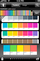
myPANTONE
http://itunes.apple.com/us/app/mypantone/id329515634?mt=8
A very interesting App which allows the user to have a Pantone Book at the touch of a button for the cracking price of £5.99. A set of 6 pantone books are worth £200-300, so if you think
you gain “the ability to build color palettes and share them with colleagues and clients. myPANTONE offers graphic, Web, fashion and apparel designers a way to take PANTONE Colors with you wherever you go.” The only negative of this App is there is no Pantone to process section (CMYK). This has to be its only down fall but its definitely worth the money!
Top features:
• Get color inspiration and create color schemes from these PANTONE Color System Libraries:
• New PANTONE PLUS Formula Guides coated and uncoated with 224 new colors
• New PANTONE PLUS Premium Metallics coated
• New PANTONE PLUS Pastels & Neons coated and uncoated
• Includes sRGB, HTML and L*a*b* data
• Capture and extract colors from photos and snap to the closest PANTONE Color
• From images loaded on your iPhone
• Directly from images taken with your iPhone camera
• Once created, share color palettes in a variety of ways:
• E-mail an HTML image of your palette
• E-mail color palettes for use in Adobe® Creative Suite® (.ase files), QuarkXPress® and CorelDraw®
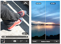
PS Express
http://itunes.apple.com/us/app/adobe-photoshop-express/id331975235?mt=8
If you use photoshop on a regular basis you’ll understand its significance in the industry, but for the designer on the go, where is Photoshop when you need to re touch a image for a client or for yourself and email it whilst on the go? Look no further than PS Express, for a completely FREE app you can do a lot with it. “With Photoshop Express, it’s easy to improve your photos. Choose from a variety of one-touch effects, or simply drag your finger across the screen to crop, rotate, or adjust color. Add artistic filters like Soft Focus or Sketch. And never fear: You can undo and redo changes until you get just the look you want—a copy of your original file is always saved.”
Top features:
• Basics: Crop, Straighten, Rotate, and Flip
• Color: Exposure, Saturation, Tint, Black and White, and Contrast
• Filters: Sketch, Soft Focus, and Sharpen
• Effects: Vibrant, Pop, Border, Vignette Blur, Warm Vintage, Rainbow, White Glow, and Soft Black and White
• Borders: Rectangle, Rounded, Oval, Soft Edge, Vignette, Rough Edge, Halftone, and Film Emulsion

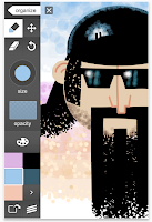
Adobe Ideas
http://itunes.apple.com/us/app/adobe-ideas/id364617858?mt=8#
Some times its so much easier to sketch your ideas than verbally explain them, this app has professional capabilities, without a doubt this app is extremely useful for on the go idea making and client meetings. Imagine sitting at a cafe and seeing visual inspiration, with this app you can take a picture and write your notes all over it and then send it anywhere you wish. Any time you need to explore creative ideas, Adobe Ideas is there with you.
Top features:
• Simple vector-based drawing tools
• Zoom without jaggies or big pixels
• Variable-size brushes using multi-touch control
• Vector eraser
• Gallery-style organizer to quickly scroll through your ideas and color themes
• Huge virtual canvas

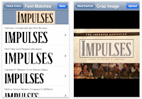
What the font
http://itunes.apple.com/us/app/whatthefont/id304304134?mt=8#
Ever seen a great font in a magazine ad, poster, or on the web and wondered what font it is? Whip out your iPhone and snap a photo, and WhatTheFont will identify that font in seconds! Its great when you need to identify a clients font used in their logo or website, this cuts the time you spend searching through font libraries from hours to seconds. From our experience What the font isn’t always correct but it gets the font close to the font you need.
In our opinion its are favorite and most useful app, we could not work without it.
WhatTheFont for iPhone connects directly to a font identification service, which has been helping customers pinpoint mystery fonts at the MyFonts.com web site for 10 years. It works via Wi-Fi or the mobile phone network, so you can get your font fix right there on the spot.
Top features:
• Snap a photo right within the app
• Choose saved photos from the Photo Library
• In-phone image processing optimizes upload for speed and accuracy
• View font details within the app
• Send e-mail summaries of search results, complete with font previews
So thats all for now folks, if you want to visit our website for information and helpful tips please visit www.tridentdesign.co.uk


myPANTONE
http://itunes.apple.com/us/app/mypantone/id329515634?mt=8
A very interesting App which allows the user to have a Pantone Book at the touch of a button for the cracking price of £5.99. A set of 6 pantone books are worth £200-300, so if you think
you gain “the ability to build color palettes and share them with colleagues and clients. myPANTONE offers graphic, Web, fashion and apparel designers a way to take PANTONE Colors with you wherever you go.” The only negative of this App is there is no Pantone to process section (CMYK). This has to be its only down fall but its definitely worth the money!
Top features:
• Get color inspiration and create color schemes from these PANTONE Color System Libraries:
• New PANTONE PLUS Formula Guides coated and uncoated with 224 new colors
• New PANTONE PLUS Premium Metallics coated
• New PANTONE PLUS Pastels & Neons coated and uncoated
• Includes sRGB, HTML and L*a*b* data
• Capture and extract colors from photos and snap to the closest PANTONE Color
• From images loaded on your iPhone
• Directly from images taken with your iPhone camera
• Once created, share color palettes in a variety of ways:
• E-mail an HTML image of your palette
• E-mail color palettes for use in Adobe® Creative Suite® (.ase files), QuarkXPress® and CorelDraw®


PS Express
http://itunes.apple.com/us/app/adobe-photoshop-express/id331975235?mt=8
If you use photoshop on a regular basis you’ll understand its significance in the industry, but for the designer on the go, where is Photoshop when you need to re touch a image for a client or for yourself and email it whilst on the go? Look no further than PS Express, for a completely FREE app you can do a lot with it. “With Photoshop Express, it’s easy to improve your photos. Choose from a variety of one-touch effects, or simply drag your finger across the screen to crop, rotate, or adjust color. Add artistic filters like Soft Focus or Sketch. And never fear: You can undo and redo changes until you get just the look you want—a copy of your original file is always saved.”
Top features:
• Basics: Crop, Straighten, Rotate, and Flip
• Color: Exposure, Saturation, Tint, Black and White, and Contrast
• Filters: Sketch, Soft Focus, and Sharpen
• Effects: Vibrant, Pop, Border, Vignette Blur, Warm Vintage, Rainbow, White Glow, and Soft Black and White
• Borders: Rectangle, Rounded, Oval, Soft Edge, Vignette, Rough Edge, Halftone, and Film Emulsion


Adobe Ideas
http://itunes.apple.com/us/app/adobe-ideas/id364617858?mt=8#
Some times its so much easier to sketch your ideas than verbally explain them, this app has professional capabilities, without a doubt this app is extremely useful for on the go idea making and client meetings. Imagine sitting at a cafe and seeing visual inspiration, with this app you can take a picture and write your notes all over it and then send it anywhere you wish. Any time you need to explore creative ideas, Adobe Ideas is there with you.
Top features:
• Simple vector-based drawing tools
• Zoom without jaggies or big pixels
• Variable-size brushes using multi-touch control
• Vector eraser
• Gallery-style organizer to quickly scroll through your ideas and color themes
• Huge virtual canvas


What the font
http://itunes.apple.com/us/app/whatthefont/id304304134?mt=8#
Ever seen a great font in a magazine ad, poster, or on the web and wondered what font it is? Whip out your iPhone and snap a photo, and WhatTheFont will identify that font in seconds! Its great when you need to identify a clients font used in their logo or website, this cuts the time you spend searching through font libraries from hours to seconds. From our experience What the font isn’t always correct but it gets the font close to the font you need.
In our opinion its are favorite and most useful app, we could not work without it.
WhatTheFont for iPhone connects directly to a font identification service, which has been helping customers pinpoint mystery fonts at the MyFonts.com web site for 10 years. It works via Wi-Fi or the mobile phone network, so you can get your font fix right there on the spot.
Top features:
• Snap a photo right within the app
• Choose saved photos from the Photo Library
• In-phone image processing optimizes upload for speed and accuracy
• View font details within the app
• Send e-mail summaries of search results, complete with font previews
So thats all for now folks, if you want to visit our website for information and helpful tips please visit www.tridentdesign.co.uk
Tuesday, 5 April 2011
CMYK & RGB Explained
 What is CMYK and RGB i hear you say, how do these 2 colour models work and when do we use them?
CMYK stands for cyan, magenta, yellow & black. These are the four colors of ink used in the four colour printing. CMYK is a color mixing system that depends on chemical pigments to achieve the desired hues.
Each image/print is made into a plate, each plate then has the desired amount of ink applied to it - when the four plates print onto a page, the colors recombine and forms the original image.
Now that we live in a digital age, much is made of the conversions between CMYK color and RGB.
RGB color varies light, instead of pigment, we see RGB color on monitors that actually emit light rather than reflect existing light. Therefore, the screen image of a picture in RGB will never match the printed image in CMYK.
The RGB color model is an additive color model where red, green, and blue light are added together in various ways to reproduce a broad array of colors. The name of the model comes from the initials of the three additive primary colors, red, green, and blue.
CMYK is used for printed items. i.e. your company brochure, stationery and leaflets
RGB is used for screen viewing items. i.e. your website and eshots
For more important information on topics of design and print, please visit our website www.tridentdesign.co.uk
For more important information on topics of design and print, please visit our website www.tridentdesign.co.uk
Subscribe to:
Comments (Atom)


